Interactive storytelling: Timeline during the pandemic
My roles
Skills & methods
Project summary
How has two years of the pandemic shaped our collective story? This interactive timeline, created in 2021 at Kristeligt Dagblad, weaves together the key moments and trends that defined our shared experience.
Through carefully selected illustrations and headlines, readers can explore the pandemic's narrative arc, diving deeper into the stories that resonated most with them. Each interaction reveals new layers of our shared history, creating a personal journey through this unprecedented time.
Awards
This story is a part of my visual portfolio at Kristeligt Dagblad which received an "award of excellence" for the best individual story page portfolio at the Society of News Design competition in 2022.
Process
The narrative emerged from analyzing over 200 articles about the pandemic in Kristeligt Dagblad. I identified recurring themes and selected headlines that best captured the evolving story of our shared experience.
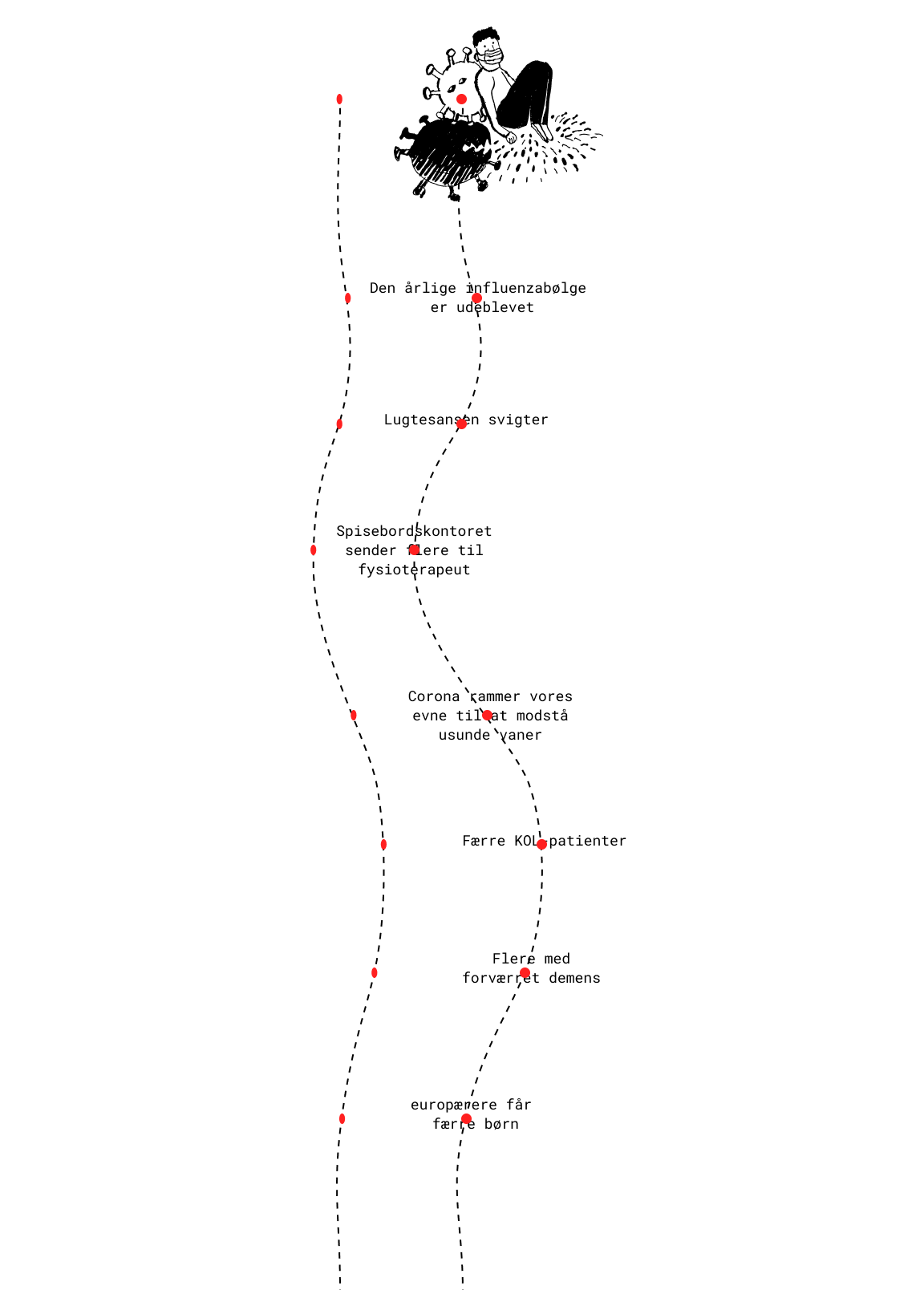
I mapped out the narrative flow in Figma, planning how the timeline would unfold across desktop and mobile. This is an early prototype of one of the story's sections:

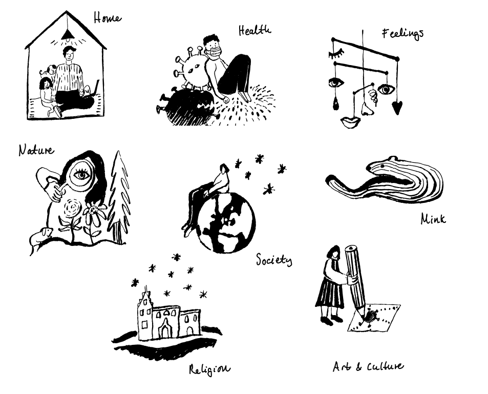
I created hand-drawn illustrations for each theme, using a tablet to bring a personal touch to the digital narrative.

I programmed the final story using CSS & JS, ensuring the interactive elements enhanced rather than overshadowed the narrative.